


Is it a language?
CSS, or Cascading Style Sheets, is a style sheet language used for describing the presentation of a document written in HTML or XML (including XML dialects like SVG or XHTML).
CSS (Cascading Style Sheets) is a style sheet language. It is not a programming language in the traditional sense. The term "style sheet language" reflects the fact that CSS is primarily concerned with the visual presentation and formatting of documents. It provides a way to separate the structure of a document (handled by HTML) from its style, making it easier to maintain and update the design of a website.
CSS describes how elements should be rendered on screen, on paper, in speech, or on other media.
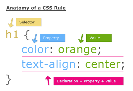
Here's an anatomy of a CSS Rule:
Applying CSS >
- Inline CSS
We can apply CSS in a single element by inline CSS technique.
The inline CSS is also a method to insert style sheets in HTML document.
If you want to use inline CSS, you should use the style attribute to the relevant tag.
Syntax:
<htmltag style="cssproperty1:value; cssproperty2:value;"> </htmltag>
Example:
<h2 style="color:red;margin-left:40px;">Inline CSS is applied on this heading.</h2>

<p>This paragraph is not affected.</p>
- Internal CSS:
Internal CSS is used to apply CSS on a single document or page. It can affect all the elements of the page. It is written inside the style tag within head section of html.
For example:
<style>
p{color:blue}
</style>
- External CSS:
External CSS is used to apply CSS on multiple pages or all pages. In this, we write all the CSS code in a css file.
Its extension must be ".css" like "iamgood.css"
For example:
p{color:blue}
You need to link this "iamgood.css" file to your html pages like this:
<link rel="stylesheet" type="text/css" href="iamgood.css">
The link tag must be used inside head section of HTML.
CSS Comments >
CSS comments are just like every comment you see in programming. It's essential for providing a context of the code.
Comments are ignored by browsers.
Comments are single or multiple lines statement and written within /*............*/
p {
    color: blue;
    /* This is a single-line comment */
    text-align: center;
}
Main Aspects >
Selectors:
Selectors are patterns that match HTML elements. They are a way of targeting specific elements to apply styles.
Types:
| Selector name | What does it select | Example | | --- | --- | --- | | Element selector (sometimes called a tag or type selector): Selects
<p>| All HTML elements of the specified type. |p| | ID selector: Selects<p id="my-id">or<a id="my-id">| The element on the page with the specified ID. On a given HTML page, each id value should be unique. |#my-id| | Class selector: Selects<p class="my-class">and<a class="my-class">| The element(s) on the page with the specified class. Multiple instances of the same class can appear on a page. |.my-class| | Attribute selector: Selects<img src="myimage.png">but not<img>| The element(s) on the page with the specified attribute. |img[src]| | Pseudo-class selector: Selects<a>, but only when the mouse pointer is hovering over the link. | The specified element(s), but only when in the specified state. (For example, when a cursor hovers over a link.) |a:hover|
Properties:
Properties are the actual styles applied to the selected elements.
Examples:
color: Sets the text color.font-size: Sets the size of the font.margin: Sets the margin space.padding: Sets the padding space.border: Sets the border properties.
    <style>
      table.tb { width: 450px; border-collapse: collapse; }
      .tb th, .tb td { border: solid 1px #777; padding: 5px; }
      .tb thead { background-color: steelblue; color: white; }
    </style>

    <table class="tb">
      <thead>
        <tr>
          <th>First Name</th>
          <th>Last Name</th>
          <th>Where from ?</th>

        </tr>
      </thead>
      <tbody>
        <tr>
          <td>Naruto</td>
          <td>Uzumaki</td>
          <td>Hidden Leaf</td>
        </tr>
        <tr>
          <td>Light</td>
          <td>Yagami</td>
          <td>Japan</td>
        </tr>
        <tr>
          <td>Ted</td>
          <td>Bundy</td>
          <td>Hell</td>
        </tr>
      </tbody>
    </table>
| FIRST NAME | LAST NAME | Where from ? |
| Naruto | Uzumaki | Hidden Leaf |
| Light | Yagami | Japan |
| Ted | Bundy | Hell |
Values:
Values are assigned to properties to define how the styling should be applied.
Example:
color: blue;sets the text color to blue.
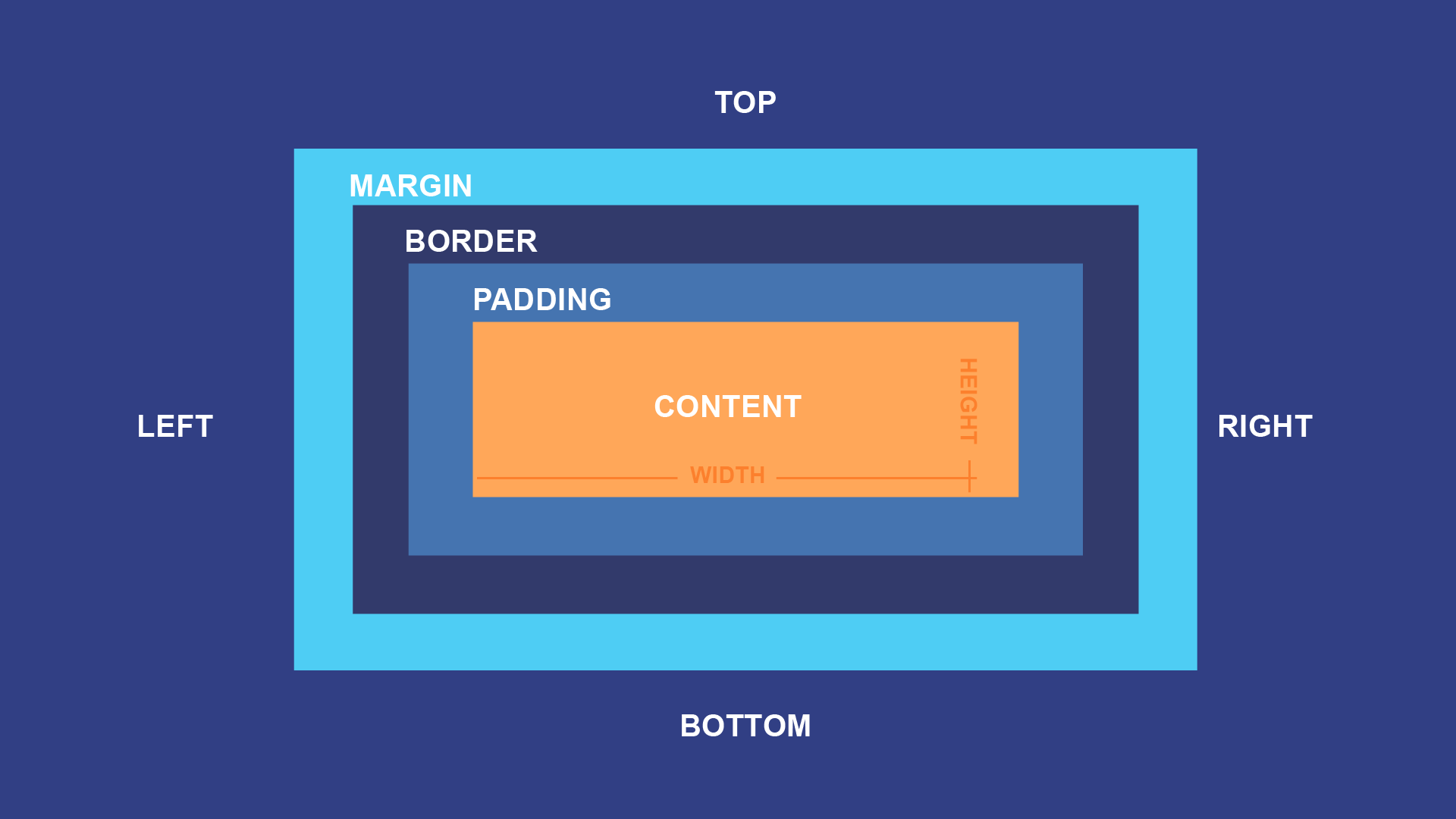
Box Model:
The box model consists of content, padding, border, and margin.
Content: The actual content of the box.
Padding: Space around the content.
Border: A line surrounding the padding.
Margin: Space outside the border.
Layout:
CSS provides various techniques for layout control.
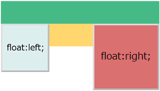
Floats: Elements can be floated to the left or right.
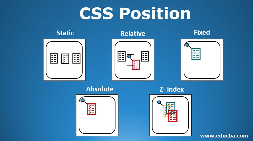
- Positioning: Elements can be positioned absolutely, relatively, or fixed.
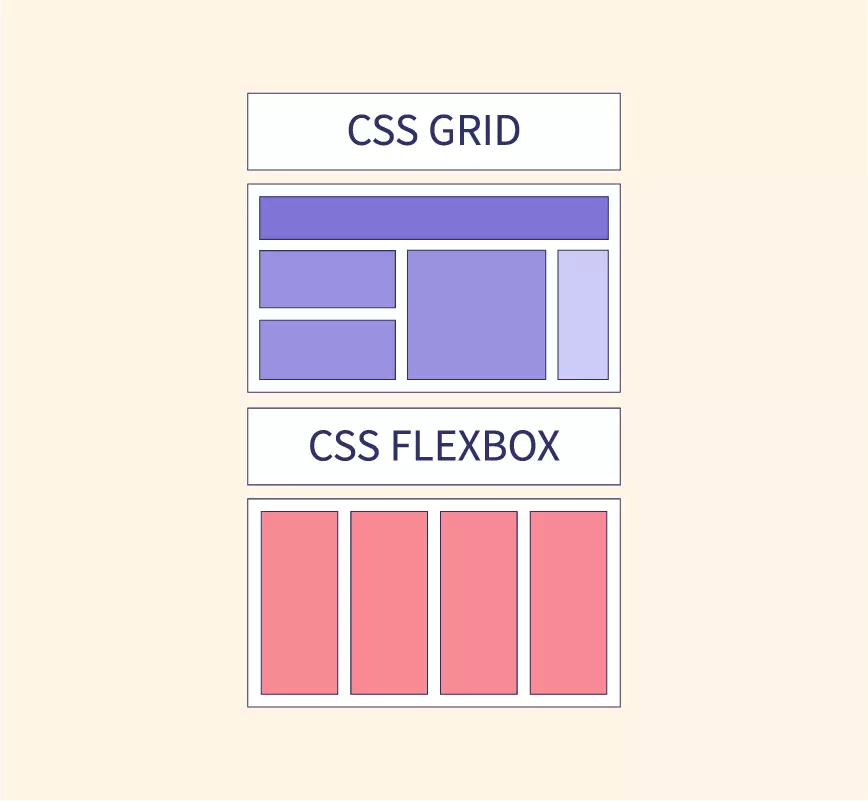
Flexbox: Provides a one-dimensional layout model for items in rows or columns.
Grid Layout: Offers a two-dimensional layout system for items in rows and columns.
Media Queries:
Media queries allow the application of styles based on device characteristics.
Example:
@media screen and (max-width: 600px) { /* styles for small screens */ }Media queries can be used to check many things, such as:
width and height of the viewport
width and height of the device
orientation (is the tablet/phone in landscape or portrait mode?)
resolution
Types:
| Value | Description |
| all | Used for all media type devices |
| Used for printers | |
| screen | Used for computer screens, tablets, smart-phones etc. |
| speech | Used for screenreaders that "reads" the page out loud |
Transitions and Animations:
CSS transitions allow smooth property changes over time.
CSS animations provide more complex and customizable animations using keyframes.
Properties of Transitions:
transitionShorthand property to combine all of the properties.transition-delaySpecifies a delay (in seconds) for the transition effect.transition-durationSpecifies how many seconds or milliseconds a transition effect takes to complete.transition-propertySpecifies the name of the CSS property the transition effect is for.transition-timing-functionSpecifies the speed curve of the transition element.
Browser Support for Transitions:
The numbers in the table specify the first browser version that fully supports the property.
| Property | Edge | Firefox | Safari | Opera | |
| transition | 26.0 | 10.0 | 16.0 | 6.1 | 12.1 |
| transition-delay | 26.0 | 10.0 | 16.0 | 6.1 | 12.1 |
| transition-duration | 26.0 | 10.0 | 16.0 | 6.1 | 12.1 |
| transition-property | 26.0 | 10.0 | 16.0 | 6.1 | 12.1 |
| transition-timing-function | 26.0 | 10.0 | 16.0 | 6.1 | 12.1 |
Properties of Animations:
@keyframesanimation-nameanimation-durationanimation-delayanimation-iteration-countanimation-directionanimation-timing-functionanimation-fill-modeanimation
Browser Support for Animations:
The numbers in the table specify the first browser version that fully supports the property.
| Property | Edge | Firefox | Safari | Opera | |
| @keyframes | 43.0 | 10.0 | 16.0 | 9.0 | 30.0 |
| animation-name | 43.0 | 10.0 | 16.0 | 9.0 | 30.0 |
| animation-duration | 43.0 | 10.0 | 16.0 | 9.0 | 30.0 |
| animation-delay | 43.0 | 10.0 | 16.0 | 9.0 | 30.0 |
| animation-iteration-count | 43.0 | 10.0 | 16.0 | 9.0 | 30.0 |
| animation-direction | 43.0 | 10.0 | 16.0 | 9.0 | 30.0 |
| animation-timing-function | 43.0 | 10.0 | 16.0 | 9.0 | 30.0 |
| animation-fill-mode | 43.0 | 10.0 | 16.0 | 9.0 | 30.0 |
| animation | 43.0 | 10.0 | 16.0 | 9.0 | 30.0 |
Flexbox:
Flexbox is designed to provide a consistent layout on different screen sizes.
It allows for the distribution of space along a single axis.
Grid Layout:
CSS Grid Layout allows for the creation of complex layouts in a two-dimensional grid.
It's particularly useful for aligning items in both rows and columns.
Vendor Prefixes:
Used to handle browser-specific implementations of certain CSS features.
Example:
-webkit-border-radiusfor the WebKit (Chrome, Safari) implementation of border-radius.
Selectors and Combinators:
Descendant Selector:
div ptargets all<p>elements inside a<div>.Child Selector:
div > ptargets only<p>elements that are direct children of a<div>.Adjacent Sibling Selector:
h2 + ptargets the<p>element that is immediately preceded by an<h2>.General Sibling Selector:
h2 ~ ptargets all<p>elements that are siblings of an<h2>and share the same parent.
Responsive Design:
Involves designing web pages that adapt to different devices and screen sizes.
Media queries are often used to apply different styles based on the characteristics of the device.
Web pages should not leave out information to fit smaller devices, but rather adapt its content to fit any device:
Desktop
Tablet

Phone

CSS Preprocessors:
Sass and Less are CSS preprocessors that extend the capabilities of CSS.
They introduce features like variables, nesting, and functions to make stylesheets more maintainable and modular.
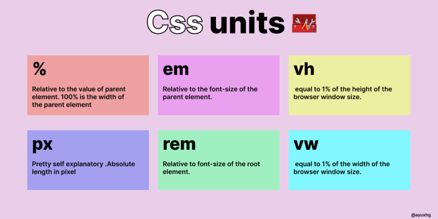
CSS Units of Measurements >
Fonts and Text >
Choose the Font:
Visit the Google Fonts website.
Browse or search for the fonts you want to use.
Click on the "+" button next to the font you want to add to your selection.
Review & Include Stylesheet:
Once you've selected your fonts, click the black bar at the bottom of the page to review your selection.
Copy the
<link>tag provided in the "Embed Font" section. This tag includes a URL with the selected fonts.
Include the Link Tag in Your HTML File:
- Paste the
<link>tag in the<head>section of your HTML file. This is typically done between the opening<head>and closing</head>tags.
- Paste the
    htmlCopy code<!DOCTYPE html>
    <html lang="en">
    <head>
        <!-- Paste the Google Fonts link tag here -->
        <link rel="stylesheet" href="https://fonts.googleapis.com/css2?family=Roboto:wght@400;700&display=swap">
        <!-- Other head elements -->
    </head>
    <body>
        <!-- Your HTML content -->
    </body>
    </html>
Apply the Font in Your CSS:
- Once the Google Fonts stylesheet is included, you can apply the font to specific elements in your CSS.
    cssCopy codebody {
        font-family: 'Roboto', sans-serif;
    }
In this example, the
font-familyproperty is set to'Roboto', sans-serif;, which means it will use the "Roboto" font if available; otherwise, it will use a generic sans-serif font.You can apply the chosen font to specific elements by targeting their selectors in your CSS.
Ending >
So that was all for the unpacking part AKA the introductory part of this series.
This series will unfold across five parts, providing a comprehensive coverage of all essential aspects of CSS needed to craft a fully functional website.
This series is all about getting hands-on with website styling using CSS. I'll guide you through the basics and beyond, highlighting the practical side of learning.
While CSS has numerous properties, the real learning happens when you try it out for yourself.
Tips to kickstart:
Tip 1: Start Simple: Experiment with basic properties like color and font.
Tip 2: Go Responsive: Learn to create layouts that adapt to different screen sizes.
Tip 3: Master Selectors: Precisely target and style HTML elements.
Tip 4: Practice Regularly: Challenge yourself with small projects.
Tip 5: Flexbox and Grid: Simplify complex page structures with these layout tools.
CSS is more than memorization; it's about understanding and application.
I hope this post has been helpful. If you have any questions, please feel free to leave a comment below.
Happy Coding !
Thank You